Offering a solution adapted to each collaboration
The brief
The French start-up Zozio develops management solutions to optimise the logistics of industrial sites. Its Robin platform allows users to visualise, understand and analyse all processes in real time in the field. To make it easier for its customers to use the tool, Zozio wanted to create new modules that were more ergonomic, more graphical and more flexible, available in a single place.
The challenge
How to integrate and configure scalable widgets within a software solution so that it adapts to the specific needs of each user?
Our answer
- 01. Setting up a collaborative design system
- 02. The creation of an ultra ergonomic UX/UI path
Setting up a collaborative design system
This methodology proved to be very effective in iterating on the various updates: colours, typography, icons, images.
The design work has been greatly simplified as the interface is regularly fed with new resources. This allows us to lay the foundations of the project and to create different blocks of modular functionality.


The creation of an
ultra ergonomic UX/UI journey

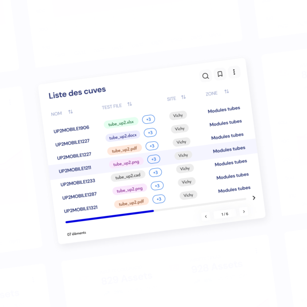
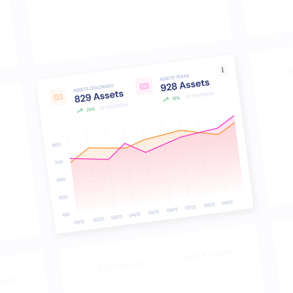
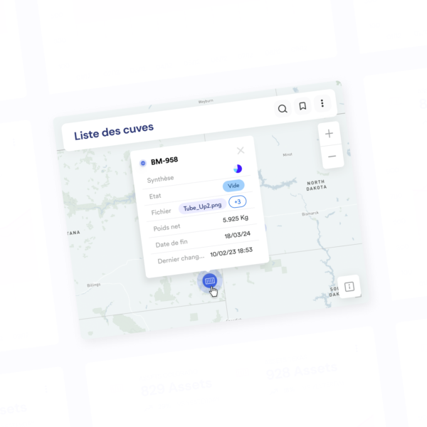
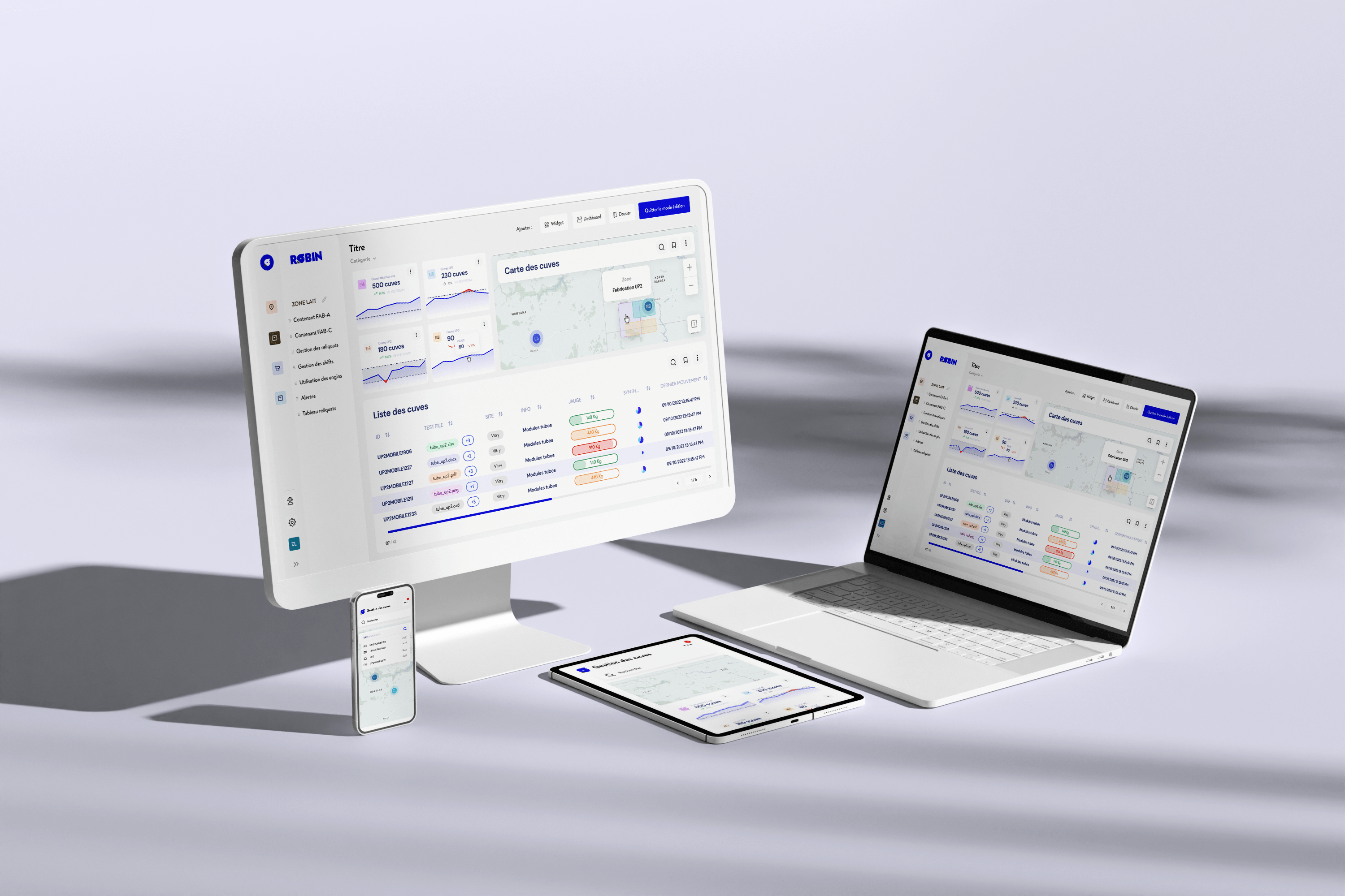
The models developed by our teams are designed to simplify the user experience: to offer the user the possibility of composing his interface, according to his problems and field issues. Histograms, pie charts, tables, gauges, interactive maps, filters or even forms, numerous functionalities are designed to create a fluid and ergonomic digital journey.
The design is resolutely dynamic to be in phase with the tool proposed by Zozio. Connected to the geolocation systems, this new version of Robin allows a better visualization of the flows and a gain of productivity for the various customers who use the solution daily.
Work
together
We put all our expertise at your service in order to carry out well-thought-out and well-executed projects alongside you. We look forward to meeting you.