Taking
a new turn to go into
start-up mode
- Website
- Identity & Branding
- Services
- UX Design
- Art Direction
- WordPress development
- Motion design
The brief
Yolt, whose main investor is ING, is abandoning its BtoC offer to focus exclusively on its BtoB activities. This strategic reorientation aims to position Yolt as the leader in Open-banking in Europe.
The challenges
How to create a new brand identity within the framework of a change in strategic BtoB positioning?
Our answer
- 01. A new website with an ultra modern design
- 02. A dynamic illustrative treatment
A new website with an ultra modern design
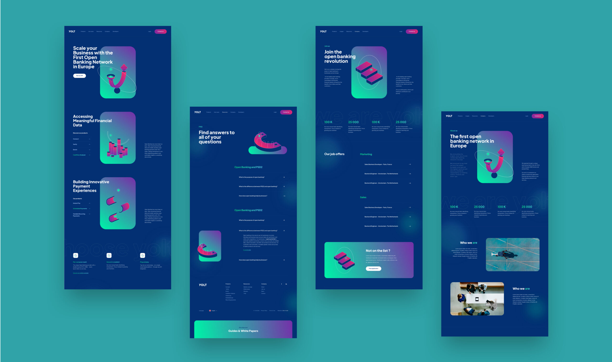
To reposition Yolt on the BtoB market and create a break with its former offer, our graphic design choice was to create a more current and modern charter. The objective was to erase the brand image that was too corporate and orient it towards a start-up spirit.
The innovative dimension of the offer is characterized by a memorable and proprietary color universe. Thus, the choice of a gradient brings a touch of energy and boldness. Blue dominates and naturally imposes itself as a reassuring color for the target.

A dynamic illustrative treatment
This new visual identity is also based on a proprietary illustrative treaty. With the design of unique geometric shapes, Yolt can reveal its personality on the market and differentiate itself by its innovative character and technology. Thus, each Yolt product is embodied by a geometric symbol.
This graphic orientation gives a feeling of movement and agitation, in the image of the sector in which the company is positioned. For this, we have developed a series of contents in motion design to enhance this notion of mobility.
Work
together
We put all our expertise at your service in order to carry out well-thought-out and well-executed projects alongside you. We look forward to meeting you.