Introducing a new solution to the audiovisual market
- Website
- Identity & Branding
- Services
- UX Design
- Art Direction
- Motion design
The brief
Yanaspot is the first all-in-one solution for organising film shoots. Aimed primarily at a foreign audience, the service aims to establish itself as a practical and technical benchmark for video creation in France. Yanaspot’s aim is to develop a website to match its ambitions and attract audiovisual professionals from all over the world.
The challenge
How do you create a strong identity and a distinctive design so that this new solution becomes a benchmark in its market?
Our answer
- 01. A colourful universe to stand out from the crowd
- 02. A visual cue as a common thread
- 03. Product-focused web design for an ultra-fluid user experience
A colourful universe to stand out from the crowd

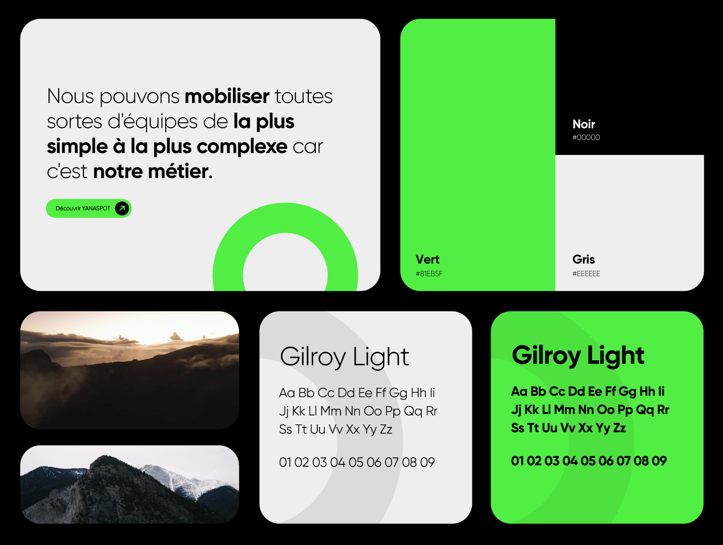
To design a unique identity, our artistic direction focused on a dominant, bold colour: neon green. This choice highlights creativity, growth and innovation, three essential elements of Yanaspot’s DNA. The colour also makes it easier to identify with the brand. To complete the palette, we’ve added a touch of elegance with black and clarity with grey.
To accompany this colourful approach, we opted for an ultra-modern, geometric typeface with Gilroy. Its legibility highlights all the brand’s commitments within its digital ecosystem.
A visual cue
as a common thread
The circle symbol can be used visually on all our different communication media. For example, on the website, this landmark is represented by a scroll or roll-over when the user interacts, and also on Yanaspot’s motion designs, the element comes to life to enhance the message conveyed.
Product-focused web design for an ultra-fluid user experience
Yanaspot’s priority is its website, with the aim of creating a tunnel that can guide customers directly to an initial estimate. With this in mind, the site is designed to be simple and intuitive, allowing customers to make a technical and budgetary estimate of their requirements in just a few clicks, by choosing the date and location of the shoot.
The design is trendy and uncluttered, leaving room for the essentials: the benefits offered by the product. The colour scheme lends freshness and credibility to all the pages, making the user’s journey easier.
Work
together
We put all our expertise at your service in order to carry out well-thought-out and well-executed projects alongside you. We look forward to meeting you.