Imagining an identity that invests in the future of energy

- Website
- Identity & Branding
- Identité
- Art Direction
- WordPress development
- UX Design
The brief
As a fund manager, HY24 aims to become the leading investor in the global hydrogen ecosystem. To achieve this goal, the company wants to develop a website to match its ambition, while giving itself a bolder, more modern identity.This case study highlights the work carried out by the agency in response to HY24’s call for tenders on this subject.
The challenge
How do you create an agile, creative website that meets the needs of different target audiences, while embodying HY24’s forward-thinking mission?
Our answer
- 01. A visual trail symbolizing an entire ecosystem
- 02. An innovative track based on low-tech design
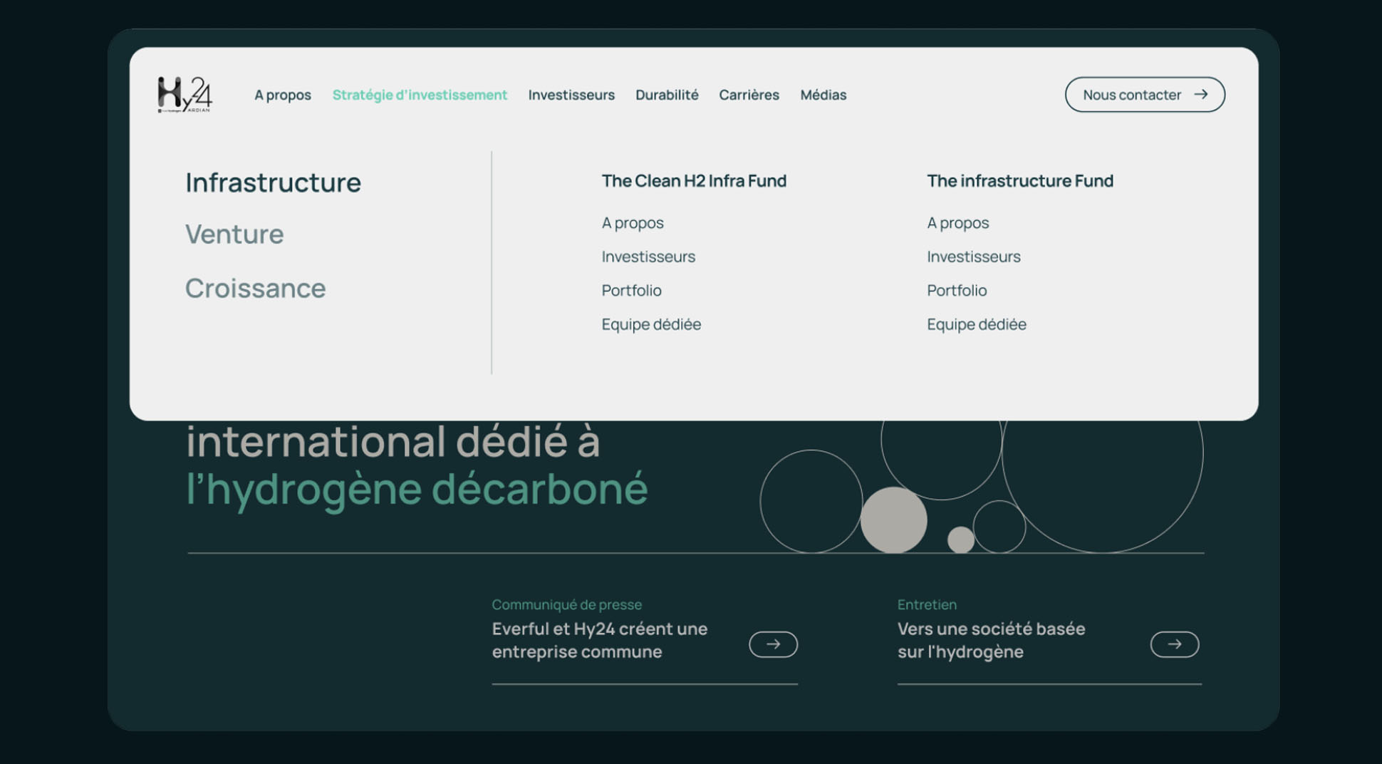
- 03. Fluid pathways to encourage action
A visual trail symbolizing an entire ecosystem


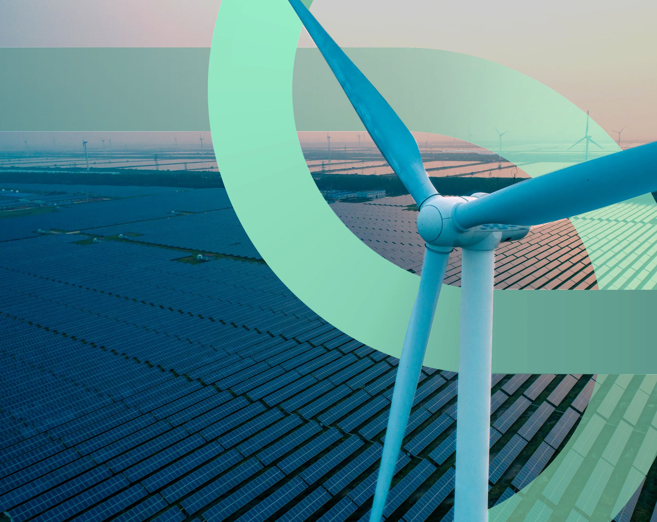
In particular, it symbolizes the notion of exchange, with its seamless curves that cross and meet.
This symbol becomes the common thread throughout the site, with two dominant colors: dark blue representing the confidence of HY24’s investors and customers, and turquoise green representing a clean, renewable energy source. We add a few gradations to create a coherent visual language.
An innovative track based on low-tech design
For visuals that are high in personality, but low in carbon, we opt for a unique graphic treatment: halftone. This involves converting photographs into images composed of an infinite number of points. This effectively optimizes the weight of resources on the site.
Fluid pathways to encourage action.

Work
together
We put all our expertise at your service in order to carry out well-thought-out and well-executed projects alongside you. We look forward to meeting you.